
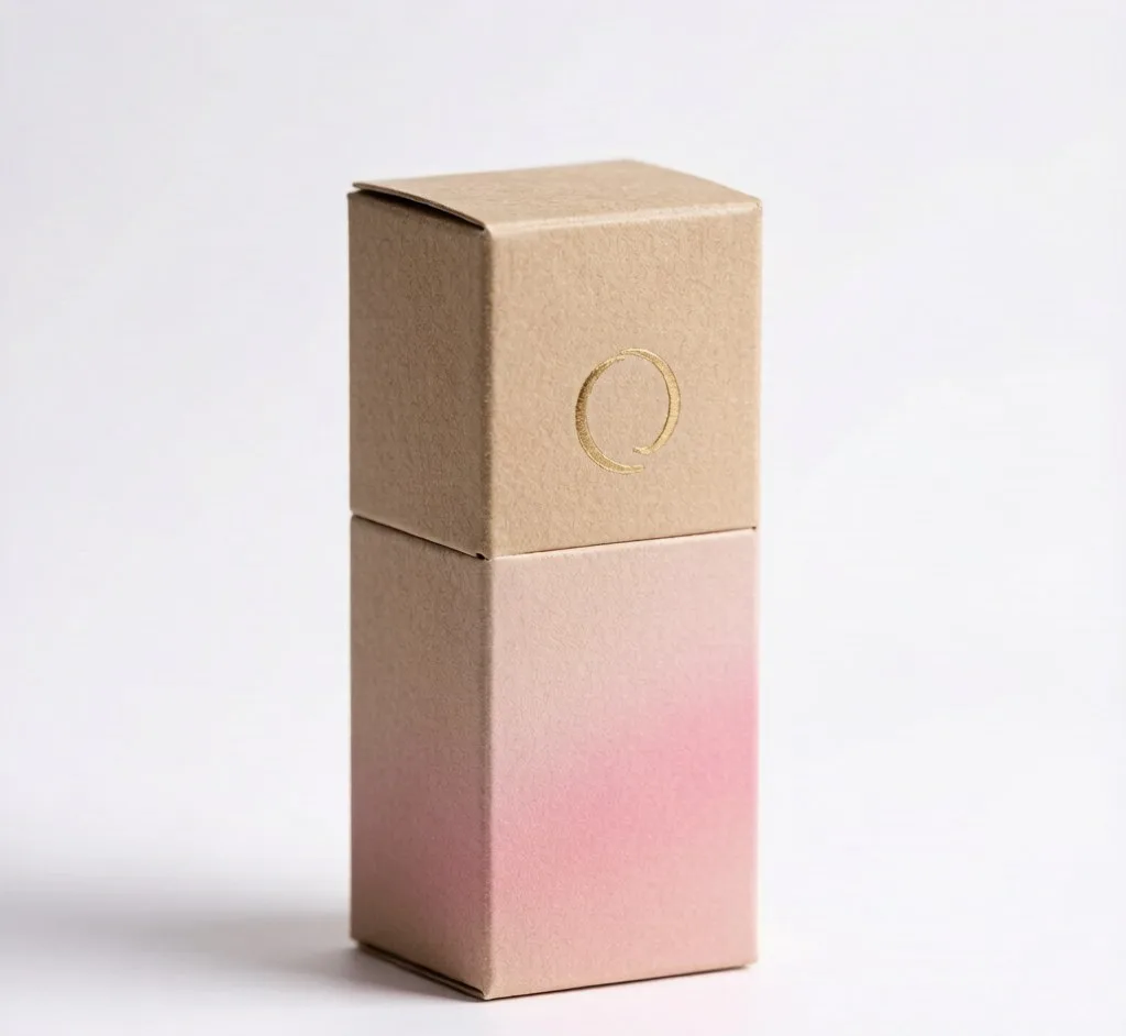
Last month an indie beauty founder messaged me with photos of three lipstick boxes she was torn between. All three looked fine in the mockups. In her hand, only one felt right. That gap between a box that feels "fine" and one that actually sells is what this post is about.
1. The closure decides the first impression
A magnetic flap closes with a soft click. A tuck-end just closes. Customers notice the click. It quietly says "this brand cares about the small stuff." If you ship premium, use magnetic. If you ship volume, a well-cut tuck-end is honest and cheap.
2. The insert is doing more work than you think
A custom foam or card insert holds the bullet dead center. No rattle in the mail. No tilted product in the unboxing photo your customer posts. We cut inserts to the exact bullet shape, not a generic circle.
3. Soft-touch beats gloss for premium
Gloss reads like drugstore. A soft-touch matte coating makes people stop and run a thumb across it. That small pause is where brand loyalty starts.
4. The window is a trust signal
A die-cut window shows the actual shade without opening the box. For a color product that removes purchase anxiety. Skip it only if the shade is already printed on the box.
5. Foil versus digital print
Digital print is sharp and fast for small runs. Foil stamping in gold or silver is the "this is expensive" cue. Use it once, on the logo, not everywhere. Over-foil looks cheap.
We make custom lipstick packaging boxes with any of these options, MOQ from 500 pieces. If you are deciding between them, send us your product and we will recommend the combination that fits your price point. The same closure logic shows up across our magnetic-closure boxes for other cosmetics.
Bottom line: the box is not just packaging. It is the first ten seconds of your customer's relationship with the product.