
The color on your screen and the color on your box are never the same animal. A logo that looks crisp in RGB on a laptop can come back from print looking a shade off, and for a brand built on one signature color, that miss is expensive. The two printing systems that decide what you get are CMYK (process color) and Pantone (spot color). Knowing which to spec, and when to pay for the difference, is one of the simplest ways to protect your brand on paper.
Most packaging complaints we hear are about color, not structure. A customer who ordered a "mint" box and received a "seafoam" one remembers the miss longer than the savings. Getting the system right up front is cheaper than a reprint, and it starts with understanding the two ways ink reaches the sheet.
CMYK: Four Inks Build Almost Any Color
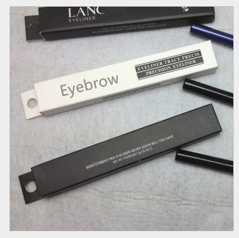
CMYK prints by layering cyan, magenta, yellow, and black dots. At normal viewing distance those dots blend in the eye into the colors you designed. It is the workhorse of custom packaging: low-cost to set up, flexible across long runs, and well suited to photography, gradients, and most brand art. On a folding carton (SBS or kraft) or a rigid box wrap (157 gsm art paper over greyboard), CMYK is usually all you need. The honest limit is that, because color is built from dots, a specific brand hue can drift a few percent between batches, especially on uncoated or textured stocks.
Dot gain on uncoated board makes mid-tones look heavier than on coated art paper, so the same file can read differently on kraft than on a white SBS carton. Tell your supplier the exact stock before proofing so the sample matches the production run, not just the screen.
Pantone: One Mixed Ink, One Exact Color
Pantone (spot) color is a pre-mixed, named ink: Pantone 185 C is always that exact red, with no dot blending and no ambiguity. You spec it when a color is the brand itself, a signature orange or a patented teal, and a few percent of drift would be noticed by customers. Spot color is also how you reach colors outside CMYK's gamut, such as certain metallics and neons. The trade-off is cost and complexity: each Pantone ink needs its own unit on press, so most factories cap practical spot colors at around six per job. On our Guangzhou offset lines (Roland, Heidelberg, Komori) we hold Pantone to the book, but it is a deliberate choice, not a default.
If your brand uses only one or two spot colors, the premium is modest; if you ask for six, press time and ink cost climb quickly, and some suppliers will push you back to CMYK. Reserve spot color for what customers actually recognize, and let CMYK carry the rest.
The Screen-to-Print Gap Is Real
The biggest source of "that's not my color" complaints is expectation, not the press. Monitors emit light (RGB); paper reflects it (CMYK). A saturated blue that glows on screen will always look a little deeper on board. The fix is to approve against a physical proof, not a screen. A printed pre-production sample lets you sign off on the real ink on the real stock before the full run. If you skip that step and judge from a laptop, you will likely be unhappy with a sound print that is actually on spec.
Calibrate your own monitor and share a printed reference, not a screenshot, so both sides judge the same thing. The disagreement usually disappears once everyone looks at ink on paper instead of light on glass.
In-House Printing Keeps Color Consistent
Color drift is mostly a control problem, and control is easier when the press is your own. As a Guangzhou factory with in-house offset, we keep the same press, inks, and ICC profiles across your reorders, so a box printed this month matches one printed six months ago far better than a trading company can promise when it farms each job to a different subcontractor. Our workshop runs under an ISO 9001 quality system, is SGS-audited, and holds High-Tech Enterprise certification (no. GR202544012474), the kind of baseline that makes color checks routine rather than lucky.
How to Spec Color on Your Next Box
A practical rule: use CMYK for everything except the one or two colors that define your brand, and reserve Pantone for those. Send outlined fonts and a calibrated reference, approve a physical sample, and tell your supplier which elements are spot and which are process. At Ecopaperbox this is handled in-house, and with MOQ 100 as our standard you can proof a small run and judge the color in real light before committing to 1,000. If you are still choosing between a rigid and a folding box, the print method is identical on both, our rigid vs folding cost guide covers the freight trade-off. And if you want a finish to sit on top of the color, our soft-touch and spot UV guide explains where gloss helps.
Typical lead time after artwork approval is 7 to 12 working days. Start with a free blank sample to confirm structure, then a printed sample to lock the color.