
Walk down any shelf and you'll notice a split: some brands wrap their product in warm brown kraft, others in crisp white. Which one looks more premium? The honest answer is that neither color is inherently more luxurious — but each sends a different signal to the shopper standing in front of it. As a Guangzhou packaging factory that prints both every day, we get asked this more than almost any other question. Here is how the perception actually breaks down, and how to pick without guessing.
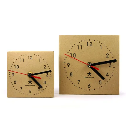
Kraft Sends a Natural, Handmade Signal
Kraft paper — the unbleached, fiber-brown stock — reads as natural, grounded, and handmade. That is why so many artisan food makers, soap brands, and indie stationery labels reach for it. The visible fleck and warmer tone imply "small batch" and "honest materials" even before the customer reads a word. It pairs well with simple one- or two-color print and a stamped logo.
The trade-off: kraft is a folding-carton stock, not a rigid one, so it leans casual rather than opulent. If your brand story is about craft and sustainability, kraft does that work for you for free. Just do not expect it to read as a luxury gift box on its own. Many brands solve this by mixing both — a kraft mailer with a white interior print is a common, effective combination that borrows from each signal.
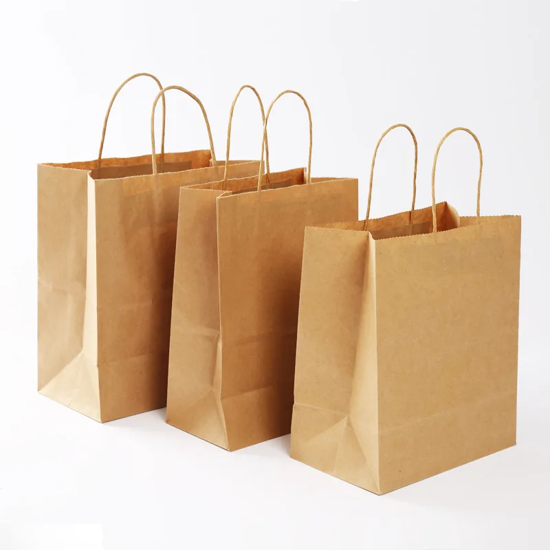
White SBS Reads Clean, Modern, and Premium
White SBS (solid bleached sulfate) card is the blank canvas of packaging. Because it prints true, bright color and supports fine detail, it reads as modern, clinical-clean, or luxury depending on the finish. Beauty and tech brands lean white for exactly this reason — a white box lets the logo and photography carry the weight. White is also a folding-carton material, so it keeps freight light.
The catch is that plain white can feel "generic" if the design is weak. White rewards strong art direction more than kraft hides weak art. A flat white box with a thin gray logo often looks cheaper than a well-printed kraft one, not the other way around.
Perception vs Reality: Neither Color Is Automatically Greener
Here is the part marketing glosses over: a brown box is not automatically more eco-friendly than a white one. Both kraft and white SBS are paper-based and broadly recyclable as mono-materials, and both can be laminated in ways that hurt recyclability. Color is a perception cue, not a sustainability certificate.
If a "natural" look matters to your customers, kraft communicates it. If third-party proof matters, the real lever is mono-material construction and, where a project needs it, FSC-certified paper sourced from FSC-certified mills (chain-of-custody documentation available on request). We hold ISO 9001, High-Tech Enterprise certification, and an SGS-audited facility at our Guangzhou workshop — but we would never tell you a box is "greener" just because it is brown.
How to Match Box Color to Your Brand
Use the box color to do a job, not as a default. A quick way to decide:
| If your brand is... | Lean toward | Why |
|---|---|---|
| Artisan food, soap, handmade | Kraft | Signals natural, small-batch, honest |
| Beauty, tech, modern premium | White SBS | True color, clean, lets design lead |
| Luxury gifting | White or black rigid | Greyboard rigid box reads as an investment piece |
| Budget-conscious launch | Either, as folding carton | Both ship flat, keep freight low at MOQ of 500 |
Real alternatives play here too. Arka and Noissue make attractive kraft and white mailers for US/UK brands who need speed and a self-serve design tool, though unit cost runs higher at low volume. Packlane's configurator is strong for white folding cartons with a clean modern feel. A Guangzhou factory like ours wins on unit price from 500 pieces up and on structural range — including rigid boxes that neither print-on-demand brand emphasizes.
Print Quality: Why White Shows Your True Brand Color
This is the practical edge most buyers miss. Kraft's brown base tints every ink you lay on it: a pastel becomes muted, a white logo disappears unless reversed out. White SBS prints your brand color as specified, which is why brands with a precise palette standardize on white. If your identity depends on an exact Pantone, print it on white and consider a Pantone spot color — we run in-house offset and can hit up to six spot colors.
Kraft is better for a one- or two-color rustic mark than for color-critical branding. Pick the surface after you know what has to print true, not before.
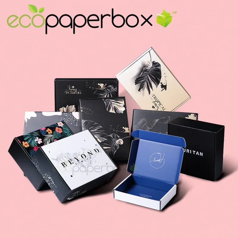
So: kraft looks crafted, white looks considered, and "premium" is something you build with structure and finish, not just color. Both are available as folding cartons from 500 pieces (MOQ of 500) with a 7–12 working day turnaround after artwork approval at our Guangzhou factory. For the practical side-by-side on materials, see our guide to kraft vs white cardboard, or read how rigid and folding boxes compare when you are ready to add a premium unboxing.